Friday 27 April 2012

Starting off part 2 of People and Place

Starting People Unaware

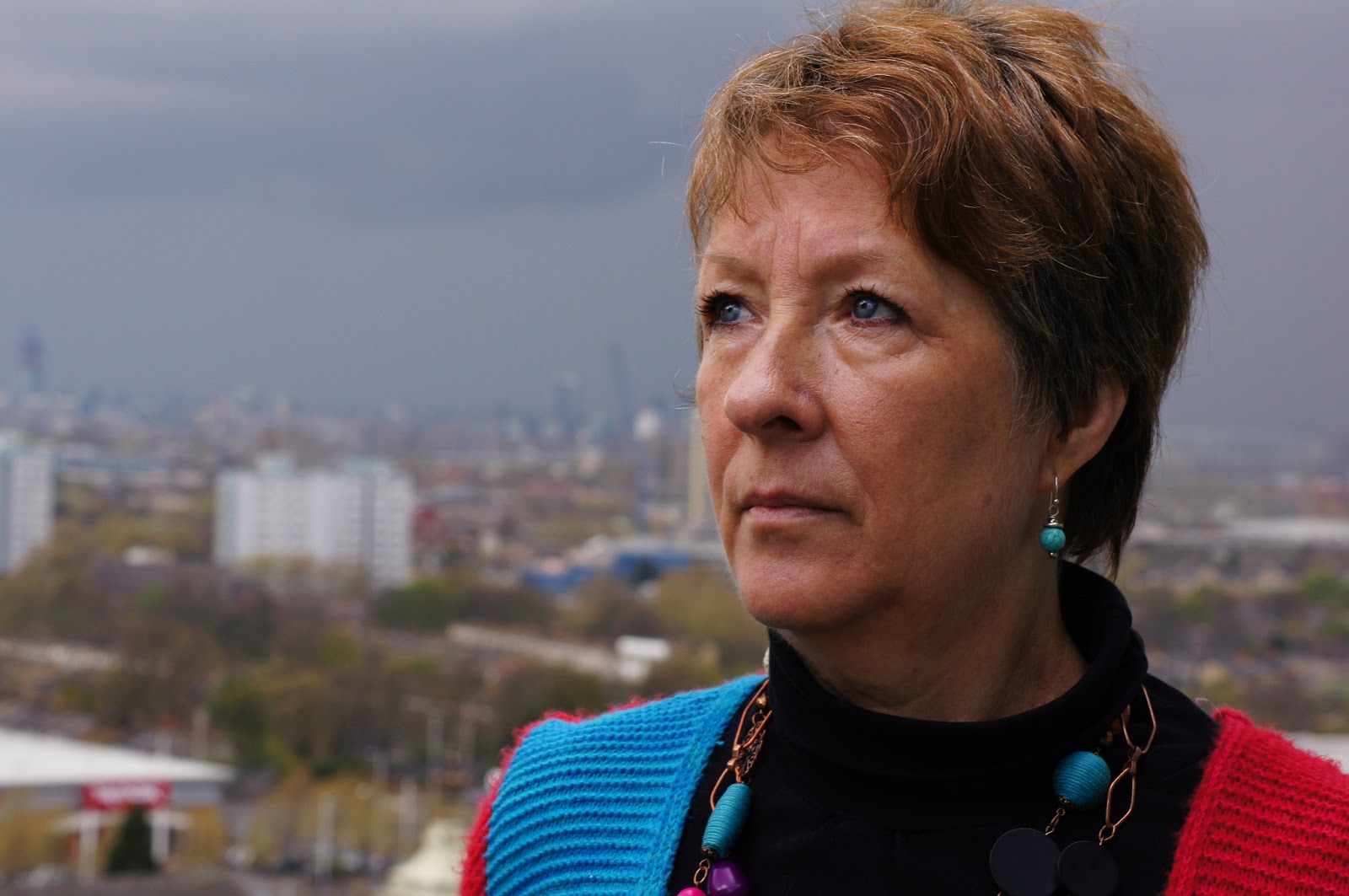
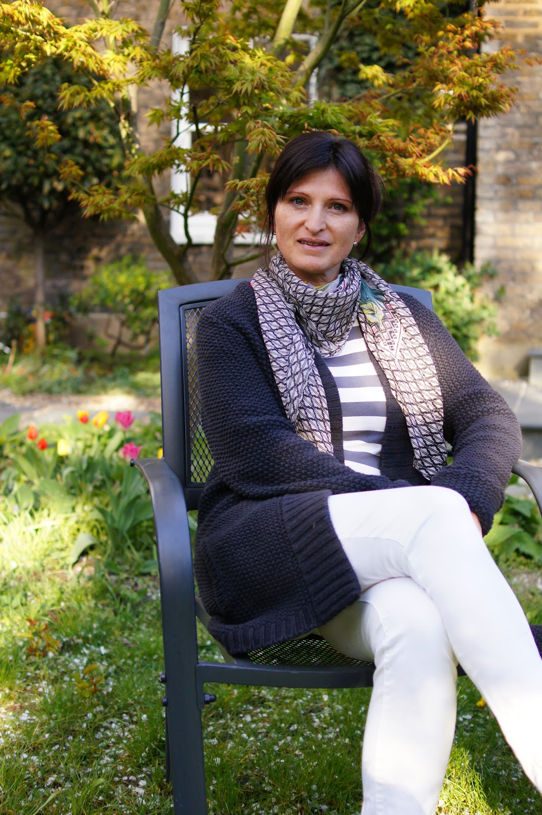
While starting to do street photography, or as it was oficially named, people unaware in the course people and place, I was quietly confident. More so, surprisingly than with people aware. Maybe there was a small, sinister and arrogant part of me, which I felt was coming to the forefront as I began my little foray into street photography. This was made up of three different reasons. The first was a familiarity in my equipment I would be using. Secondly I felt, rather than nervous- as the author of the course had suggested, strangely slightly excited. Maybe this was because last but not least I had playfully had a bit of experience taking 'satisfying' shots of unsuspecting strangers as can be seen here.

Monday 23 April 2012

Assignment 1 - A portrait


1.
Assignment one- a portrait: I made sure to take some time over this assignment as the author of the course had suggested and photographed my model on different shoots. I found it quite challenging to come up with different ideas, which differed in type and style but in the end, I was satisfied with the outcome and glad I spent some time over it.

   For the first portrait I had found a very interesting (in my opinion) fir tree, which I thought had the potential for creating an unusual but effective backdrop for my model. I discovered that this was, from my point of view, the case and it did actually surpass my expectations as the shape of the tree became important in relation to the model in the final photo for this shoot. More specifically the tree seemed to form an oval around her, almost as though it was cradling her.

   I asked my model to wear clothes that were pretty complementary to the tree. Although not completely complementary (the tree was green, the clothes were orange) I thought the effect of contrast in colour was effective and made her stand out from the tree. If I was to change anything about this photo it would be maybe using completely complementary colours (so red and green).
2.

   The second portrait was kind of forced because the weather only permitted me to take indoor shots at the time. However I was pleasantly surprised that I found a way to ‘use’ the ‘bad’ weather to my advantage. Here the model was looking out of a raindrop-covered window with a wistful expression on her face. I decided to use off-camera flash here for two reasons. This was to make her more conspicuous against the grey and brown of the houses/weather on the opposite side of the street and also to highlight the rain droplets on the window. I wanted to highlight the rain droplets so the viewer could pick up on the reason she was looking wistful. I was quite happy with my attempt at highlighting the rain droplets but thought they could have stood out a bit more and very happy with the illumination of both the hand and face by the flash. This was because the hand, in my opinion, was an extension to her wistful mood.
3.

   In the third photograph I chose a completely different type of day to photograph my subject; namely night. I concentrated here on context where the background could be discernible as a famous landmark of London, namely Tower Bridge. I thought the out-of-focus bright lights of Tower Bridge in the distance worked well in providing context in a subtle manner. As for the photographing the model I found the night setting to be very challenging in order to get a sharp (in terms of subject movement) photo but I thought I just about managed this. In order to manage it I had to use a high ISO setting on the camera and a fast lens. This meant image quality was sacrificed a little because of the high ISO and the nose looked inevitably larger than if I had used a longer focal length lens (I used a standard prime lens) as I had found out in the focal length exercise. However I felt these compromises were comparatively small in respect to the sharpness of her face.
4.

   I decided to use some of the experience I had gained from the lighting exercise; in particular learning from a photograph by Richard Avedon of Carl Dreyer, director, Copenhagen, April 8, 1958. I used natural lighting like he did but I used softer light than he used. The principle was the same though, which created the effect of her ‘looking out’ at the scene behind her. This was dissimilar to Richard Avedon’s photograph in his photograph Carl Dreyer was merely looking in the same direction as the light was hitting his face. So Richard Avedon’s photo was simpler (less busy) and probably more effective. If I was to be more critical I would say the background was a bit bland with the buildings too blurred. In summary for this fourth photograph I would say that the lighting of the face was the best part of this photograph.
5.

   I asked my model to pose in the fifth photograph for the assignment in such a way that she was in partial profile to the camera and her hand was raised to a flower she smelled. I would say the mood of this photograph was pleasantly tranquil with the clothes (deliberately) mimicking the colour of the large flower and the lighting quite soft. All of this makes for a nice portrait in my opinion and I didn’t have any real criticisms of it. My only quibble was the patch of bright light in the upper left-hand corner, which detracted slightly from her face.
6.

   I thought up what I felt was quite a clever portrait for the sixth photo where the torso and head were visible but with a twist. The front of the head was visible through a mirror only, while the body and back of the head were only visible in the foreground. I was pleased with how I carried out the idea with a few minor touches that made the photo more attractive. These were the colour coordination of the clothes and the edge of the mirror and the hairbrush raised to the head suggesting activity. I could maybe have used more interesting lighting but overall I am pleased with this photograph.
7.

   Finally I used photographic lighting to change an unremarkable pose into something I felt was striking. I lighted her face from the left side of her body in such a manner that only the left side of her face was visible and used a black backdrop behind so that half of the face was the only thing apparent in the photo. I also asked her to raise her hand to her chin with a finger pointing, suggestively to the light. This was an experiment that I thought worked well and provided interest and drama to the photograph.

Varying the pose


Varying the pose: the three main types of posing by models in magazines I found were standing, leaning and sitting. Standing varied immensely, from profile shots, to walking shots and also less conventional ones like legs wide apart and arms spread as I saw in the photograph of model ‘Alli’ at ‘Photogenics’ by Sondra Stocker in You magazine- 15 April 2012.
1. (Standing)
2. (Standing)


   Of course, in fashion and commercial magazines ‘inviting’ poses are desirable in order to sell products. There were many ways photographers’ work I looked at in such magazines achieved this. Some of these were subtle as well. For example with the cover photo of Nicole Trunfio by Zoltan Tombor in You Inspire magazine (4 March 2012), her hands are raised above her head in a manner that shows off the dress she is wearing. This is because it is quite an extravagant way to have the hands arranged above her head, which attracts the eye. The viewer’s eye then automatically ‘falls’ down to the dress she is wearing. The dress mirrors the extravagance of the hands position. So without gesturing at all to the dress Zoltan Tombor has subtly shown off the dress to its full extent.
4. (Standing)
3. (Standing)

   So I tried to use this principle in one of the photographs of my subject standing (number 4). I thought it worked well. The static nature of her clothes (horizontal stripes) was reflected by her arms raised directly above her head in reflection to her clothes. However, I thought the 1st photo I took of my subject standing (1) was the most effective. This was because the pose looked unforced, yet interesting. I thought the legs crossed in number 2 was a nice touch but the photograph as a whole was a bit static. For 3 I felt the interaction with the surroundings was interesting and attractive (since it was blossom she was holding) but if she had been facing the camera with her head it would have been better.
5. (Sitting)
6. (Sitting)

   I then got my model to sit in a chair while I took various poses. I thought the photograph where she was looking over the back of the chair (7) was unusual but in an effective way: the pose is quite dramatic and attractive because of this. Numbers 5 and 6 were minor variations of each other with slightly different framing. I liked both but thought the way her arms were in 5 made her look engaging while with 6 they made her look reserved.
7. (Sitting)
8. (Sitting on ground)
9. (Sitting on ground)
10. (Sitting on ground)

   Finally for varying the pose I asked her to sit on the ground with her legs outstretched. This pose was drastically different from just sitting on the chair I found and I was most pleased with these three photographs for this exercise. The reason for this was because each variation of that pose I felt worked well to set a certain mood. Number 8 I decided was welcoming, 9 thoughtful and 10 curious. Overall number 9 was my favorite as it looked very natural as well.

Focal length


1. 18mm on APS-C camera
2. 35mm on APS-C camera
 I learnt a lot from the focal length exercise, mostly how a wide focal length can make a model’s features so disproportionate. By examining the resultant photographs I could see most obviously that the widest focal length used (18 mm on an APS-C crop camera) was most drastically disproportioned. The nose looked bigger than the rest of the face (especially the eyes) and the face looked thinner in comparison to the later shots. At 35mm (on an APS-C crop camera) everything was similarly disproportioned but less so. This trend continued with 55mm (on an APS-C crop camera) but by 85mm (on an APS-C crop camera) the effect wasn’t noticeable to me. The cheeks had ‘filled out’ and the nose was ‘compressed’. I found 135mm (on an APS-C crop camera) was very similar to 85mm (on an APS-C crop camera) in terms of proportions. However at 200mm (on an APS-C crop camera) the facial features looked a tiny bit too compressed for my liking.
4. 85mm on APS-C camera
3. 55mm on APS-C camera


5. 135mm on APS-C camera
6. 200mm on APS-C camera

Review a portrait sequence

1.
As I reviewed the portrait sequence for ‘review a portrait sequence’ immediately afterwards I remembered the checklist and thought I had got a good balance for lighting and the general (simple) composition. This then allowed me to concentrate on the person and her expressions.

3.
2.
   I tried to vary the directions she was looking and the expressions she made by asking her to explain different parts of her garden, which was where we had agreed to do the portrait sequence. For the first three shots I asked her to not look at the camera, wanting to start off by experimenting with my subject looking away from the camera. This was because I felt it would look more natural and so in the time between the ‘looking away’ portraits and the ‘looking at’ portraits, my subject would have overcome any nerves she might be feeling. However, she was more relaxed than I had expected and by the fifth photograph I asked her to look straight at the camera. This was partly because in the fourth photograph she accidentally looked almost straight at the camera, which I thought looked quite flattering anyway.
4.

5.
6.
7.
   I then decided to bring another factor into play, namely the addition of her hand(s) through photos 7-9. This was to add something different that would have an effect on her expressions, as I had previously found out with the ‘portrait- scale and setting’ exercise. As she was preparing to and started to explain something about the garden I took a few shots, with her hand(s) prominent as well as the face. I did this for three frames. I remembered seeing the different hand position had an effect on her expression, although not as substantial an effect as I had hoped. However I liked 9 best out of those three at the time as she was clearly right in the middle of explaining something.

8.
9.
10.
   The conversation then changed to something else about a plant in the garden in particular and I started photographing as her expression changed. From frames 10-17 she was explaining to me in more detail how the plant grew while I captured the different expressions. I remembered this being the part of the shoot where I captured subtly different head positions but where the difference in the perceived expression was comparatively large.
12.
11.

   For four more frames I tried to get natural shots of her talking, which I thought at the time were all sufficiently different to capture. I thought that these four were very natural and at this time she was completely comfortable with being photographed.

   Finally for the last 8 frames I decided to experiment with head and shoulder variations. This included her looking slightly to the side, looking somewhere completely elsewhere than the camera, shoulders turned slightly and her smiling. It was at this time I decided to stop shooting because I felt quite a few nuances of expression had been explored and I thought the time elapsed was long enough for it to become a bit uncomfortable if I had continued photographing any longer.

13.
14.
16.
15.
17.
18.
19.
Reviewing the portrait sequence a second time, after looking at them properly, I saw that there were quite a few I liked but also quite a few that were similar. I was surprised to see one of my favorite photographs out of all of the sequence was the first. I thought it looked extremely natural, which I wasn’t expecting. I therefore rated the first photograph as good. I thought with the second photograph she looked more apprehensive and less natural than the first one, which I found strange so I gave it a not good rating. The third was much more acceptable as any nerves she might have been feeling were dissipated by being in the process of explaining something. The fourth and fifth photos were not good for me because the expressions were (accidentally) portrayed as maybe mild anguish, while in fact they were only her explaining something. Photograph 6 in the sequence was only acceptable, I felt, because although it was natural, the parted mouth was captured at slightly the wrong moment. Number 7 was similar in this regard so acceptable but I managed to rectify this in 8, which I rated as good; she was looking upwards more while in thought. In retrospect I didn’t like 9 as much as I thought the first time of reviewing and only felt it was acceptable. This was because although the hand helped to show she was conveying something well, I felt the eyes weren’t prominent enough to get across the expression to the viewer of the photograph. 

20.
21.
I rated 10 as good as she was clearly making a point (that was captured in the photograph) even without a hand raised. Number 11 was not so good for the subtle reason of her head being placed too centrally to the camera, which while making a point, I felt, looked unsatisfactory. Her hand was raised again in photograph 12 as she made another explanatory point but I thought her hand took up too much space in the photo, which made the photo only acceptable, not good. I was a bit disappointed with 13 because I caught her smile at slightly the wrong moment although I would still rate it as acceptable. This is because the smile was still recognizable as a smile. I quite liked 14 and rated it as good, mostly because it was very natural. However, the mouth was open maybe a tiny bit too much for it to be a really attractive photograph for me.

22.
   On the other hand I disliked 15 a lot because the eyes were inexpressive as they were too screwed-up and the mouth was open too much so I rated it as not good. Number 16 was better, although I felt on a second look that a raised hand would have helped to convey to the viewer that she was explaining something. I rated 17 as not good because although her mouth and angle of the head were very good, the eyes were looking straight at the camera, which had the adverse effect of slight hostility, I felt. This was in combination to the angle of the head. My view remained the same as before in that the changes in expression were subtle in these few photographs (13-17) but large in resultant effect on the viewer.

23.
24.
   Numbers 18-22 were all good for me, with the body communicating ease and head showing alertness. I was quite satisfied with 23 but I thought maybe I had asked her to look upwards a little too high so I rated it as good only. Number 24 I found very soft and even peaceful and rated it good, mainly because of the face being tilted to profile. I thought 25 was pretty as the whole body communicated relaxedness so I rated it as good. I was not very keen on 26 as I viewed it a second time as it looked too posed for my tastes.
25.

26.
   Number 27 however, was my favorite shot of all for the opposite reason of the subject looking so natural and unconcerned. I thought the slight smile added something extra to the photograph and was complemented with the face being profile to the camera. The number 28 photograph was natural and attractive too but I thought the body and head were facing a bit too centrally so I rated it as good. Lastly, with 29 I thought was only acceptable as the smile was a little too full with the face and body similar to 28; too central.
27.
28.
29.